Displays from a programmer's perspective
When it comes to choosing a good monitor for programming, there is a ton of strong, wildly differing, and (in my opinion) wrong advice floating around. So I thought I would summarize my thoughts on reasonable things to look out for in making a purchasing decision. Note that I will not be recommending any specific models, just general factors to consider. A site like RTINGS (unaffiliated) will be able to provide much more detailed reviews of individual models than I ever could.
Size: as big as comfort allows
The bigger your display, the more stuff you can see at once without scrolling. So my simple advice is, “buy as big as you can comfortably use.” 27 to 32 inches is a good sweet spot that will fit in almost any setup. I would only go for 24 or 21 inches if I couldn’t physically squeeze anything bigger into my workspace. There are even 42 to 48 inch TVs that double as monitors, but you will likely need a deep enough desk to use it without having to do a neck workout every time you look at the corner.
Resolution: aim for 110 PPI, preferably higher
Technically, the amount of stuff (lines of code, pages of documentation, app windows, etc.) you can fit on your screen depends not on its size but its resolution. That makes the number of pixels the most important factor when it comes to productivity. A picture is worth a thousand words:
At 1080p, the lowest I'd go, I can comfortably fit 50 lines of code and a file explorer along with two files open side by side, or in my case, one file next to a terminal.
At 1440p, that jumps to 70 lines of code. I can also squeeze another file in. Alternatively, I could put an HTML/CSS/JS file next to a browser window to test on the same monitor.
At 4K (if I had the eagle eyes to use it at 100% scaling), I could fit a massive 110 LOC and three files plus a terminal. I could also have HTML source code and a browser testing window with enough room to even show devtools, all on the same monitor. Or I could fit four (4!) 1080p editor windows on each quadrant of the screen.
So why did I discuss size first? For any fixed-sized monitor, pixels can only get so dense before the whole interface is too small to practically use. For the average person with healthy vision and sitting an arm’s length away from their screen, this threshold is in the ballpark of 110 pixels per inch. So your chosen size will limit what resolutions you should shoot for. A 27-inch 1440p is 109 PPI, which is why this size and resolution pairing is so common.
A monitor with a PPI lower than 110 will have the same amount of virtual real estate as a smaller one of equivalent resolution while being less sharp. For example, the ubiquitous 24-inch 1080p (92 PPI) won’t fit any more lines of code than a 21-inch 1080p (105 PPI), and media will be slightly more pixelated. So in my opinion there isn’t much point in going lower than 110 PPI. On the other hand, you can go for higher PPIs and use scaling, and I’ll explain later why I think you should. Below is a table of PPIs for common monitor sizes and resolutions. I’ve put checkmarks next to recommended combos.
| 1920x1080 | 2560x1440 | 3840x2160 | |
|---|---|---|---|
| 21″ | 105 ✓ | 140 ✓ | 210 ✓ |
| 24″ | 92 | 122 ✓ | 184 ✓ |
| 27″ | 82 | 109 ✓ | 163 ✓ |
| 32″ | 69 | 92 | 138 ✓ |
| 42″ | 52 | 70 | 105 ✓ |
Why you should go for HiDPI and scale
Although 110 PPI is OK, there are two reasons why I suggest going higher. The first is font rendering.

A lowercase g rendered at 1x and 2x in 12 point Menlo, the default on VS Code for macOS.
A programmer’s job is to stare at text for eight hours a day. So the second most important thing to consider after a big virtual desktop is clear and readable text. It is simply impossible to render letterforms to any degree of fidelity when the amount of pixels you have to work with can be counted on your fingers. As you can see in the image above, the g on the left looks more like a blob of pixel soup than a letter. And the English alphabet is on the simple side. It’s even worse with CJK characters:
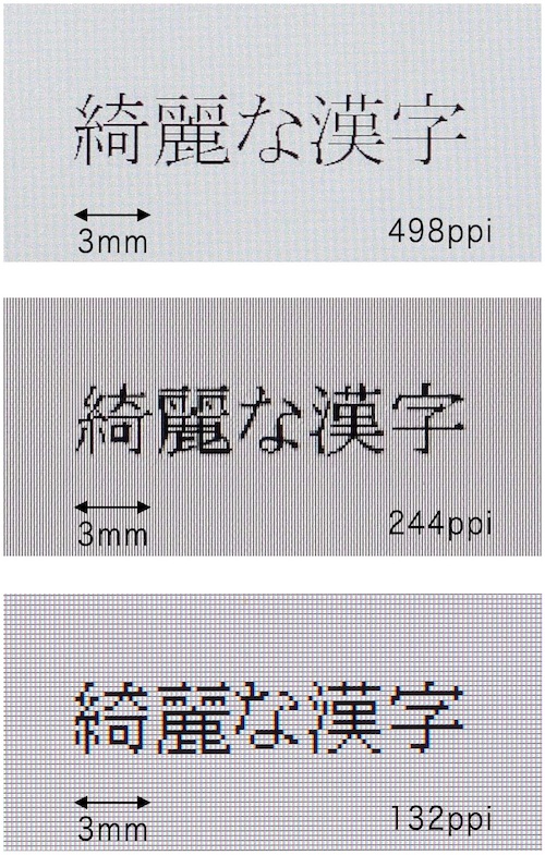
The last row is an absolute abomination to look at.
(I have no idea where this image originated. Google reverse image search turns up dozens of matches on different websites. If you are the creator let me know and I will credit you.) Windows’ aggressive hinting and subpixel antialiasing will help a bit, but nothing beats increasing the raw number of pixels the computer has to paint with.
The second and more minor reason is that you’ll instantly see if you forgot to ship 2x assets, or if your app isn’t resolution independent in general. There is another side to this coin, though: apps that haven’t been updated to play well with HiDPI will look wonky. This is a non-issue on macOS, where the first Retina MacBook is soon turning a decade old at the time of writing. In fact I would avoid low PPI monitors like the plague if you’re on macOS since Apple killed subpixel antialiasing in Mojave, so text looks terrible on non-Retina displays. But Windows and Linux are still usable at low resolutions and given their slow adoption of HiDPI support, a low PPI monitor still makes sense if it means your apps won’t break.
Fractional scaling is perfectly fine
If your chosen size-resolution combo has a PPI that’s not close to a multiple of 110, you will have to use fractional scaling. This means assets that were designed to align perfectly to the pixel grid like bitmap fonts and retro game artwork will look blurry because fractional pixels don’t exist.

Yuck! Thankfully, modern operating systems handle fractional scaling much better.
Some people insist that integer scaling is the only way to go for this reason. This is where I will have to disagree. This effect is only really noticeable in UIs with a ton of pixel perfect assets. For example, Windows 95 looks awful with non-integer scaling because the whole OS is rendered with bitmap fonts and pixel art. Antialiased fonts and vector icons that scale well to any size dominate modern OSes. Speaking from experience, I use a 4K display running at 2560x1440@2x (equivalent to 150% in Windows) every day and have no complaints about sharpness.
There are other valid reasons to avoid fractional scaling, however; it is reportedly not as polished as integer scaling in Linux. And macOS implements fractional scaling by doing 2x integer scaling internally and then downsampling. So in my case, the GPU is actually pushing 5120x2880, which is nearly 80% more pixels than 4K. In essence, I’m wasting computational power, and the increased load puts noticeably more lag on pre-Xe Intel integrated graphics.
A note on PWM
Some displays reduce brightness using pulse-width modulation, where instead of reducing the power to the backlight, they simply switch it on and off very quickly. This flickering is too fast for most people to detect, but some report eyestrain and headaches using PWM displays, especially ones with lower frequencies. If this is you, be sure to look out for flicker-free monitors.
Other considerations
If you’ve made it to this point, congratulations! You’re essentially done, but there’s other factors that can improve your quality of life.
Panel type
There are two main display technologies: organic light emitting diodes (OLED) and liquid crystal displays (LCD). OLEDs are common on phones and TVs because they have infinite contrast ratios and near-instantaneous response times, making them great for consuming content. But they are susceptible to burn in, which is a flaw for computer monitors that show static UI elements for long periods of time.
LCDs can be further split into in-plane switching (IPS), vertical alignment (VA), and twisted nematic (TN) panels. TN panels are cheap but have generally the worst image quality and should be avoided. IPS panels are the safest bet in all areas except contrast, where they get beaten by VA. However, VA panels have narrower viewing angles (still much better than TN though) and suffer from slower pixel transition times and black smearing, which can be distracting.
Finally, some expensive high-end IPS displays can dim individual backlighting zones. This is known as mini-LED and has the potential to produce OLED levels of contrast without the risk of burn-in. But since the best mini-LEDs only currently have a couple thousand dimming zones spread across millions of pixels, there can be blooming around small bright objects against dark backgrounds.
Refresh rate
Almost every regular display refreshes 60 times per second, while there are gaming monitors that go up to 120 hertz and beyond. Fast motion handling is a competitive advantage for gamers, but programmers still benefit from buttery smooth scrolling and responsive mousing. That being said, high refresh rate doesn’t meaningfully improve productivity and is more of a nice-to-have. If I had to chose between resolution and refresh rate, I would prioritize resolution.
Coating
Almost every monitor comes with a matte layer applied in front of the panel, while almost every other device (phones, tablets, TVs) are glossy. Matte is a must-have if you work in a bright, reflective environment. But if you can control your lighting conditions, glossy gives far superior picture quality. Dave2D has a great video about the subject that I’ve pulled the following two images from.
As this Cyberpunk 2077 footage shows, matte coatings kill vibrancy. But it’s not just about contrast or colors. Matte gives a bit of fuzziness to all text as well:
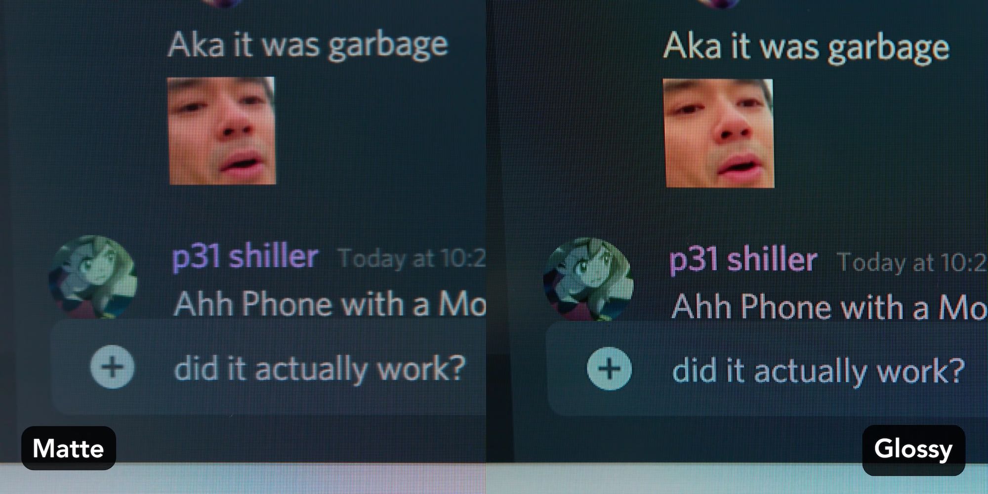
Sharp text is essential for programmers, but unfortunately nobody sells glossy desktop monitors. I’m not asking matte to be killed off, I am just hoping manufacturers will give consumers more choice.
Brightness, color gamut, contrast
Brightness should not be a problem for desktop monitors, but it is useful if you want HDR or for laptops being used outdoors. Aim for 500 to 600 nits for comfortable use under an overcast sky without shade and entry level HDR. 1000 nits is required under direct sunlight and good HDR.
A color gamut close to 100% sRGB should be enough as that is what the web and games are mastered in. Higher coverage may be useful if you do photo or video editing.
As for contrast, higher is better, but it’s not something you can choose independently since contrast ratio is pretty much exclusively determined by panel type. TN and IPS offer 1000:1, VA 3000:1, mini-LED 1,000,000:1 and OLED infinite.
Aspect ratio
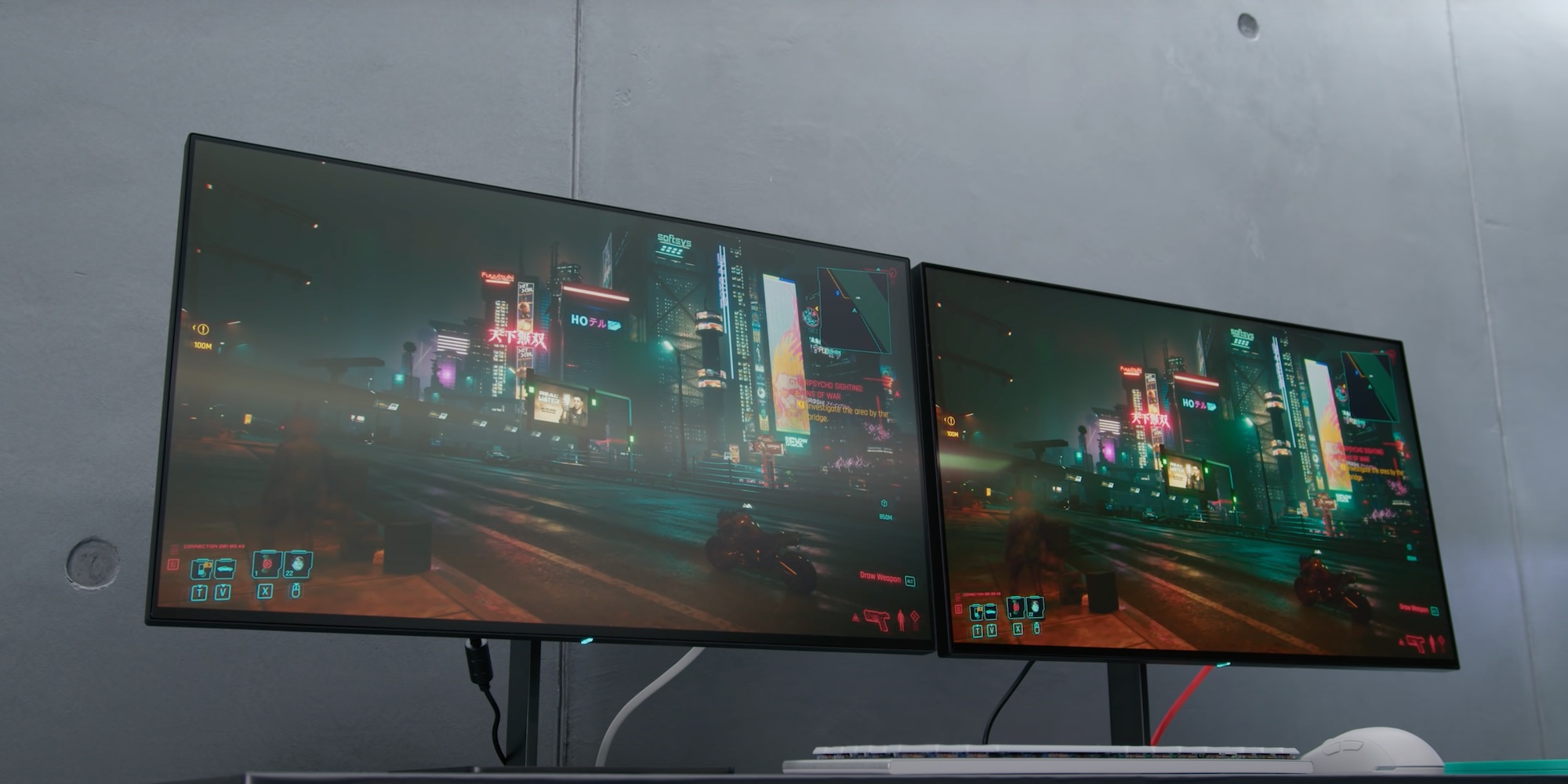
All this time I’ve only mentioned 16:9 displays, but there are 21:9 ultrawides out there. Ultrawides can extend your workspace without the bezels of a multi-monitor setup. They are relatively pricey: as Linus Tech Tips put it, instead of being priced as if the manufacturer extended the sides of a regular 16:9, they’re priced like a huge monitor that just had its top and bottom sliced off. In addition, there are no HiDPI ultrawides except for this $1300 5120x2160 LG (a glossy version of this would probably be my dream monitor).
Ports
Finally, if you frequently hook up a laptop to your monitor, a USB-C input that supports video and charging over a single cable may be convenient.
Conclusion
So with all this out of the way, what type of monitor would I recommend? The answer is a 32-inch 4K IPS: big enough to have more workspace than standard 24 or 27 inch monitors, but small enough to use scaling for increased clarity in text and images. Preferably glossy and 120 Hz, but such a combination doesn’t exist yet. One can dream!